
The MARMIND® dashboard offers the option of creating new, individual evaluations in the view type "configurable charts". There are essentially two types of charts:
- Type 1: Chart with timeline: show evaluations over time
- Type 2: Diagram with custom X-axis: freely configure and label graphics
Click on “Add diagram” (1) - the “Create diagram” popup opens (2). Select the desired type here and click on "Apply" (3). A placeholder for your diagram appears where you need to set the configuration of the diagram(4).
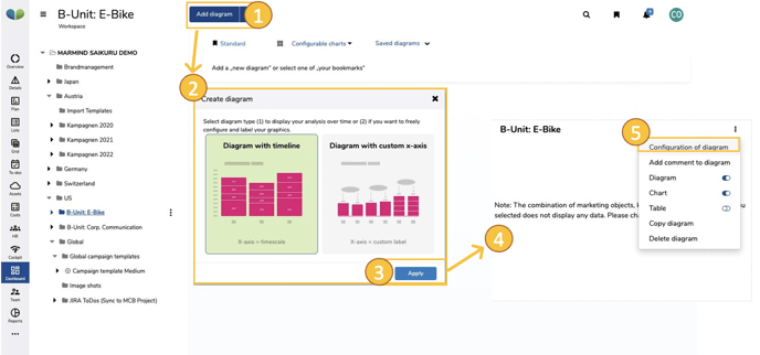
When creating a chart, a three or four-level configuration menu (5), which can also be used like a settings wizard, is run through:
- Selection of objects
- Add key figures
- Add Indicator (only for type 1)
- Edit diagram display
The following sub-chapters describe this menu for both chart types, with the specifics of each type being discussed.
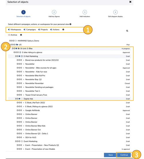
Selection of objects (chart type 1 & 2)
By clicking on the menu item "Select objects", the "Selection of Objects" popup opens. In order to limit the selection list of objects, you can hide individual object types using the toggles on top (1).
Use the three-dot toggle  to select the marketing objects you want to analyze and compare. Objects that are included in the selection are highlighted in light blue(2).
If you select an object with included sub-objects (e.g.  ), sub-objects created later are automatically integrated into the dashboard graphic.
Click on “Continue” (3) to complete the object selection and to switch to the next settings menu “Add key figures”.
The selection can be adjusted as often as you like - if you don't want to go through the entire wizard, click on "Apply" at this point.
Note: Data are only displayed in the chart once all the necessary parameters have been set in the settings wizard.
Add key figures (chart type 1 & 2)
In the next wizard menu you will see the settings for "Add key figures" (alternatively you can access this menu directly via the gear symbol  of an existing chart). Here you can select key figures as well as operational goals, the values of which are then displayed in the chart. The key figure menu differs here depending on the chart type:
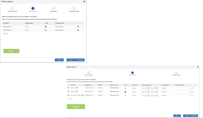
For type 1, select the desired key figures, define your chart type (area, line, stacked column, grouped column, dashed line, interpolated line, points, etc), assign a color and - if there are several key figures - define a secondary axis if necessary .
Type 2 offers extensive configuration options.
More details on the configuration of type 2: In chart type 2, you can create whole blocks of key figures. Since type 2 has a variable x-axis, you can create graphs for different values of ONE key figure (e.g. compare different periods of actual values or, for example, plan and actual values from the same period). You can also display several of these key figure comparisons in one chart.
First select a key figure (1) - if you want to display several key figures, click on "Add new" (another row of key figures will be added).
Important note
The following applies to both chart types: As soon as the first key figure is selected, the selection list of the key figures is reduced accordingly to possible combinations: only key figures with the same interval definition (e.g. [week]) are then available for selection.
Currently only the chart type “stacked columns” is available as a display type, but a grouping of the key figure can be defined in order to display further information within the bar (standard, action category, channel, target group, product, context or interval). This groups the underlying data and recalculates the graphic. The grouping can also be canceled again ("Standard").
The option to display a difference arrow (3) is only possible if at least two bars are configured for a key figure (see 7).
As in type 1, you can also assign colors for the respective key figures (or for the individual bars of key figures in type 2). These colors are used when the representation enables a clear display (e.g. 1 object and 1 KPI).
Important note
The following applies to both chart types: If the value shown is no longer unique due to the configuration (e.g. 2 objects and 1 key figure or when selecting a "grouping"), the colors of the stored standard color scheme are automatically being used.
With the value type (5) you determine the mapping of the actual or plan values of a key figure (possibly also scenarios). In chart type 2, you can not only compare different time periods, but also compare plan and actual values for the same period.
Define the time range from which the values of the bar should be drawn and select the value display for these values (absolute numbers or in percent). In order to be able to read and understand the diagram correctly, give the bar (6) a clear name (shown on the X-axis).
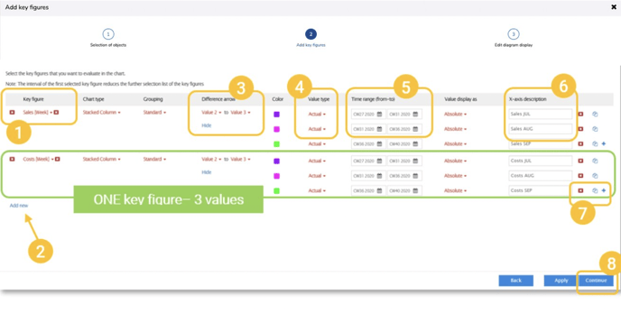
Click on the "+" symbol on the far right (7) to add another bar. To remove individual bars, click on the “x” symbol  to the right of the input field for the description of the X axis. For efficient work you also have the option to copy a bar click on the
  -symbol (also to the right of the input field for the description of the X-axis).
When the configuration for the key figures (both chart types) is complete, click on “Next” (8). The following also applies here: The selection and configuration of the key figures can still be edited later.
Add Indicators (only chart type 1)
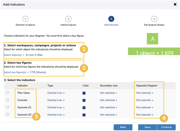
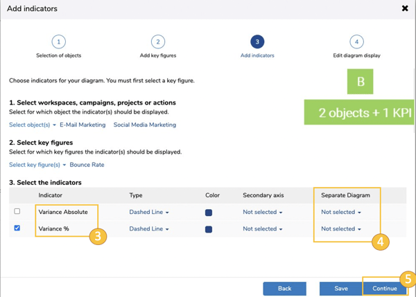
For chart type 1, the indicator menu follows the key figure menu in the settings wizard. Depending on the number of objects and key figures selected in the previous menus, MARMIND® offers a selection of appropriate indicators (plan values, variances, forecasts and scenario values). The combination of objects and key figures in the indicator menu is decisive for the indicators available in each case:
- 1 object - 1 key figure: plan value, forecast, scenario values.
- 1 object - 2 key figures: Variance between the key figure values
- 2 objects - 1 key figure: Variance between the object-related values.
- 2 objects - 2 key figures: Not compatible
Indicator menu:
Under point 1, choose your object of interest (1). Then select one or more key figures (2). Corresponding indicators (3) are available depending on the object-key figure combination (compare figure A above and figure B below). You determine the appearance (type & color) for this value as well.
You can also display individual indicators in a separate chart (4) - this appears below the main graphic.
The selection of indicators can also be edited afterwards.
Clicking on “Continue” (5) takes you to the last wizard menu “Edit diagram display”.
Edit chart display (chart type 1 & 2)
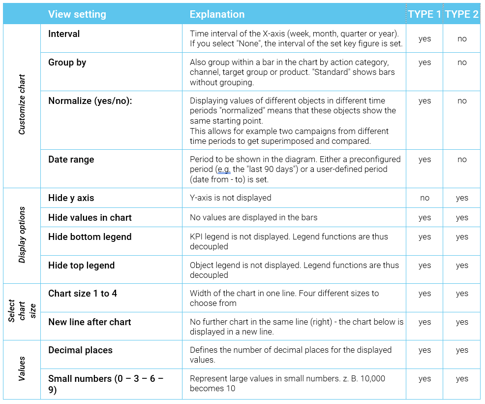
Your chart gets the final touches in the configuration menu "Edit chart display". You can configure the following view settings for your chart diagram here:
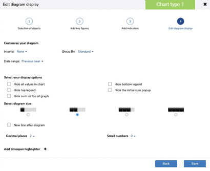
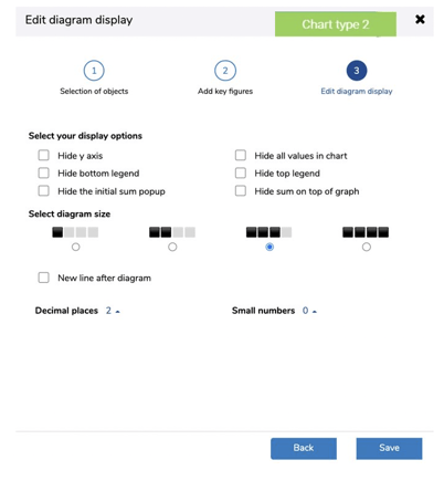
With this final configuration, your chart is complete. Click on “Save” to close the settings wizard. You can see the result of your configurations in the dashboard.
How you save the chart you have just configured and how you manage views is described in the following chapter.