After you have configured and saved your chart, you will see the result in your dashboard. The two chart types are now viewed again in their presentation in the dashboard. Since the configuration options for each chart type are very extensive, only examples are used in the following subsections.
Chart type 1
In the chart type 1 you can see
- Name and description of the chart
- Next steps menu: Here you can cofigure the diagram as well as copy or delete it. Also a comment can be added for each chart when clicking on "Add comment to diagram"
- Save existing diagram: With the "!" triangle button you can save the existing diagram (or revoke the changes
- Legend above (object legend): Names and number of selected objects. Click on the three dots menu next to an object name to open the next steps menu. Only the first object is always displayed. If several objects are selected, you will find them in the drop-down list.
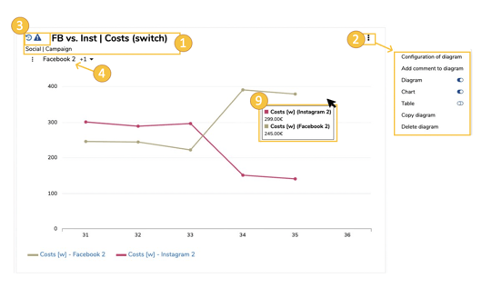
- Y-axis: Range of values
- X-axis: Time range (depending on the configuration - week, month, quarter, year)
- Graphic representation of the values: Bars, lines, points and / or areas (depending on the configuration).
- Infobox: Shows the key figure values per grouping (e.g. object). Can be removed by clicking on the "x" symbol.
- Mouseover in the graphics area: individual values of the selected objects (according to configuration)
- Secondary chart (indicator): Below the main graphic (depending on the configuration) a secondary chart with the values of the set indicator is displayed.
- Legend below (graphic legend): Here the graphic colors are assigned to the values for each object. By clicking on a legend element, the key figure table opens (for "unique" - i.e. key figure values assigned to an object)
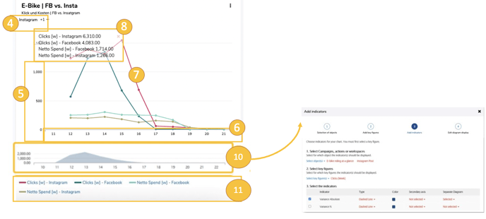
The spider menu mentioned above offers (similar to the plan) additional functions. The detail popup of the object can be opened via the object legend (1) and then click on "open next steps" (2) and additional elements in the spider menu (3) can be created (e.g. to-dos).
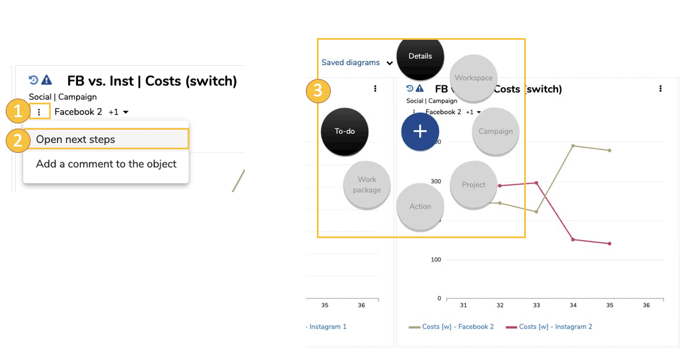
Chart type 2
Chart type 2 has no object or key figure legend. Otherwise the elements are similar to those in chart type 1 - depending of course on the respective configuration.
For comparison, the settings menu for the chart below is shown again on the left.
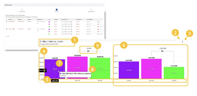
In chart type 2 you can see
- Name and description of the chart
- Next steps menu: Here you can cofigure the diagram as well as copy or delete it.
- Comment function: in the three dots menu also a comment can be added for each chart when clicking on "Add comment to diagram"
- Y-axis: Range of values
- X-axis: Name of the bar (according to configuration)
- Bar group: All values of a key figure according to configuration
- Individual bars: Key figure values according to configuration
- Mouseover on the bar: Individual values of the selected objects (according to configuration)
- Difference arrow: Shows the difference between two values according to configuration
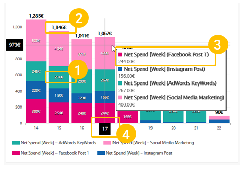
Numerical values in graphics:
The dashboard charts also show the readable values (1) for each key figure / object as numerical values. In addition, where possible, total or average values (2, 3) are generated (e.g. total over a stacked column for all individual values in the column). The mouseover shows the exact values of the current position of your mouse pointer (4). In this way, detailed or intermediate values can also be temporarily displayed and read out in the graphic.